Hello and you know what?
Let’s talk about infographics. How much do you know about infographics? So I just delve into the idea, to get my hands on it and get more creative. Then i came across this infographic by CNN.
Source link: https://www.cnn.com/politics/impact-programs-agencies-government-shutdown-vis
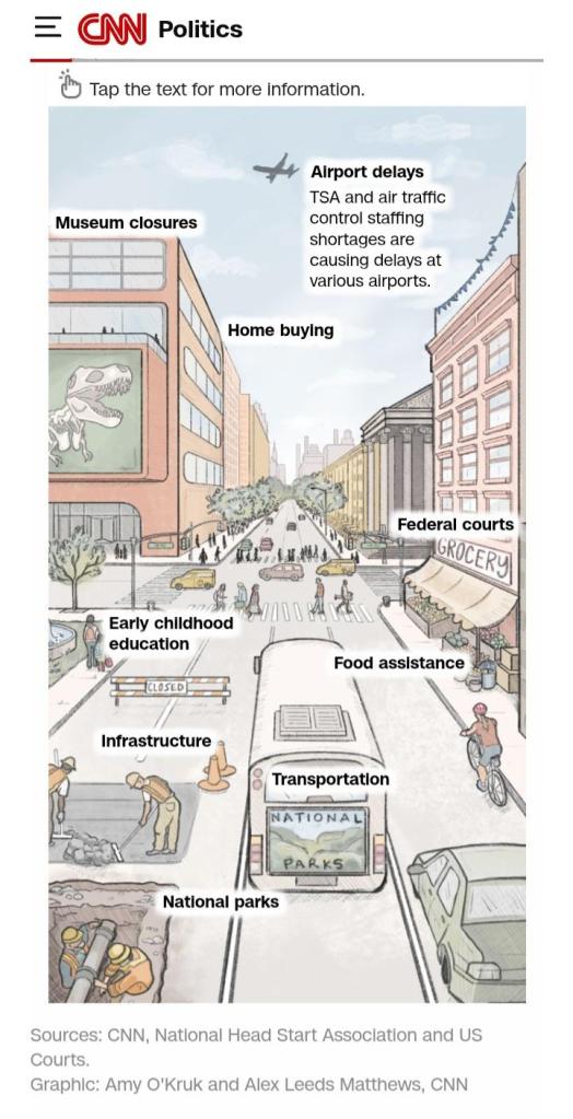
During the US government shutdown of 2025 that happened from 1st October to 23rd November 2025. CNN published an infographic representation of the possible implications of a government shutdown on October 23, 2025.
Taking a look at the content, structure and quality of the work, one can with no doubt agree that it is a very good representation of the situation and expectation from the situation at the time, as well as puts it in a simplified infographics.
The image summarised and made adequate representations using human, vehicles, buildings, objects etc. to show how the government shutdown is and could affect the daily lives and activities of Americans at the time. It went further to introduce a drop down that expands upon tapping each of the labels, which upon doing so, shed light on the label tapped. Example; we have tapped on the label “Airport delays” and from the image attached, it shows further details on how the shutdown affects and/or lead to airport delays. The same is applicable to the other labels (Museum closures, Home buying, Federal Courts, Early childhood education, Food assistance, Infrastructure, Transportation, National parks) on the image upon tapping any of them.
Such infographic representation makes it easy to understand and give context to the publication easily. And sometimes understand without even having to go through the entire details of such situation. In summary, it makes it easier and faster to understand an event properly.
So, guys looking at the image attached, what do you think about it? And about infographics generally? Comment below!


Leave a comment